
It’s our 30th Anniversary

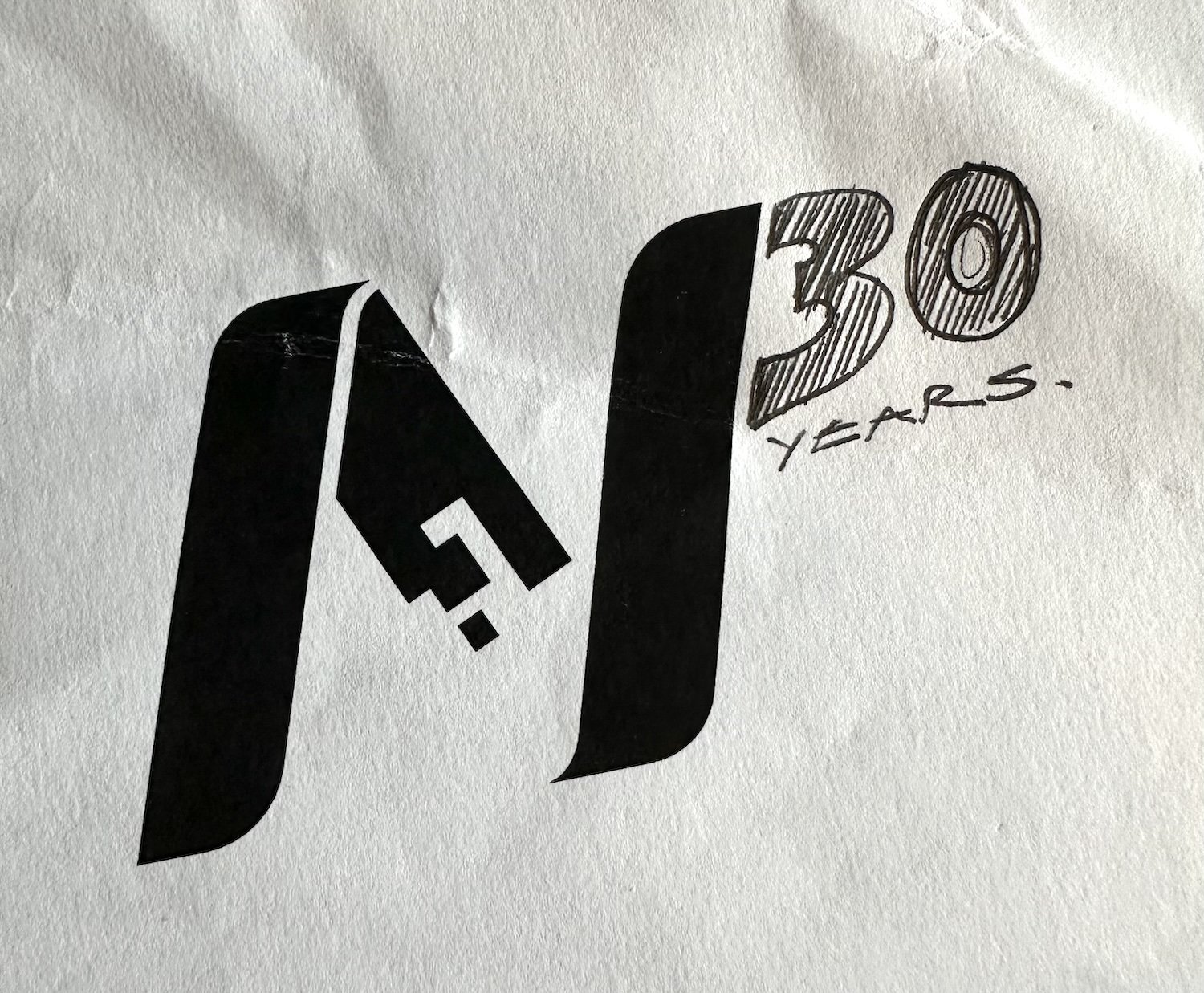
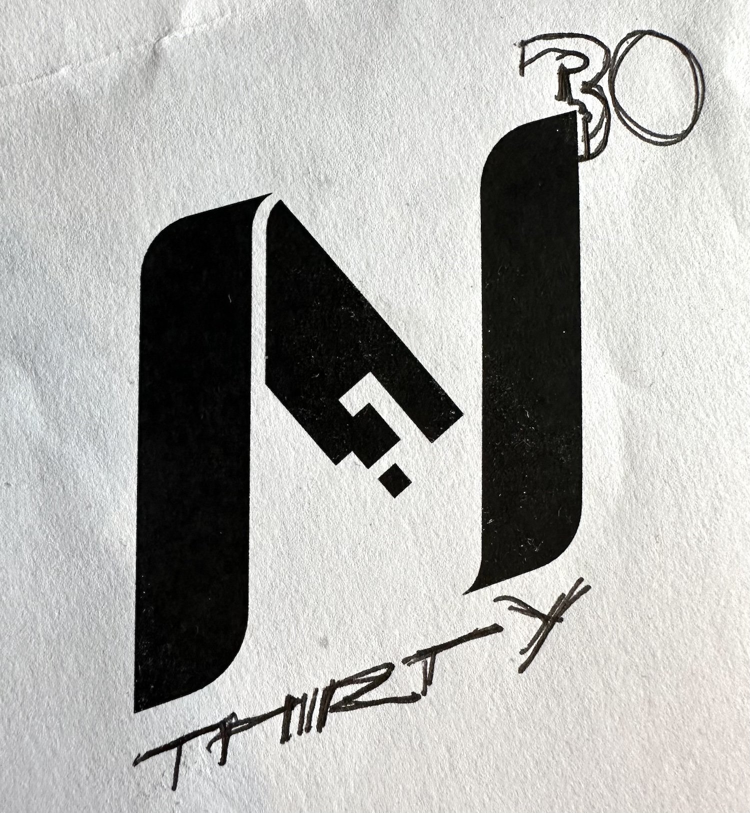
Nexus Alpha Limited turns 30 this year and as part of our year-long series of celebrations and plans, we’re starting off with an updated logo. Rather than just show the finished item though, we wanted to share some of the ‘workings’. As ever, the best place to start is with a pen and paper before moving on to some initial ideas on the computer.


There were a number of elements to add - the main one being the ‘30’ - but also, the word ‘Anniversary’ - and in some instances the years that the company has been active. This was quite a lot of information so fonts and colours for these parts were going to be important.
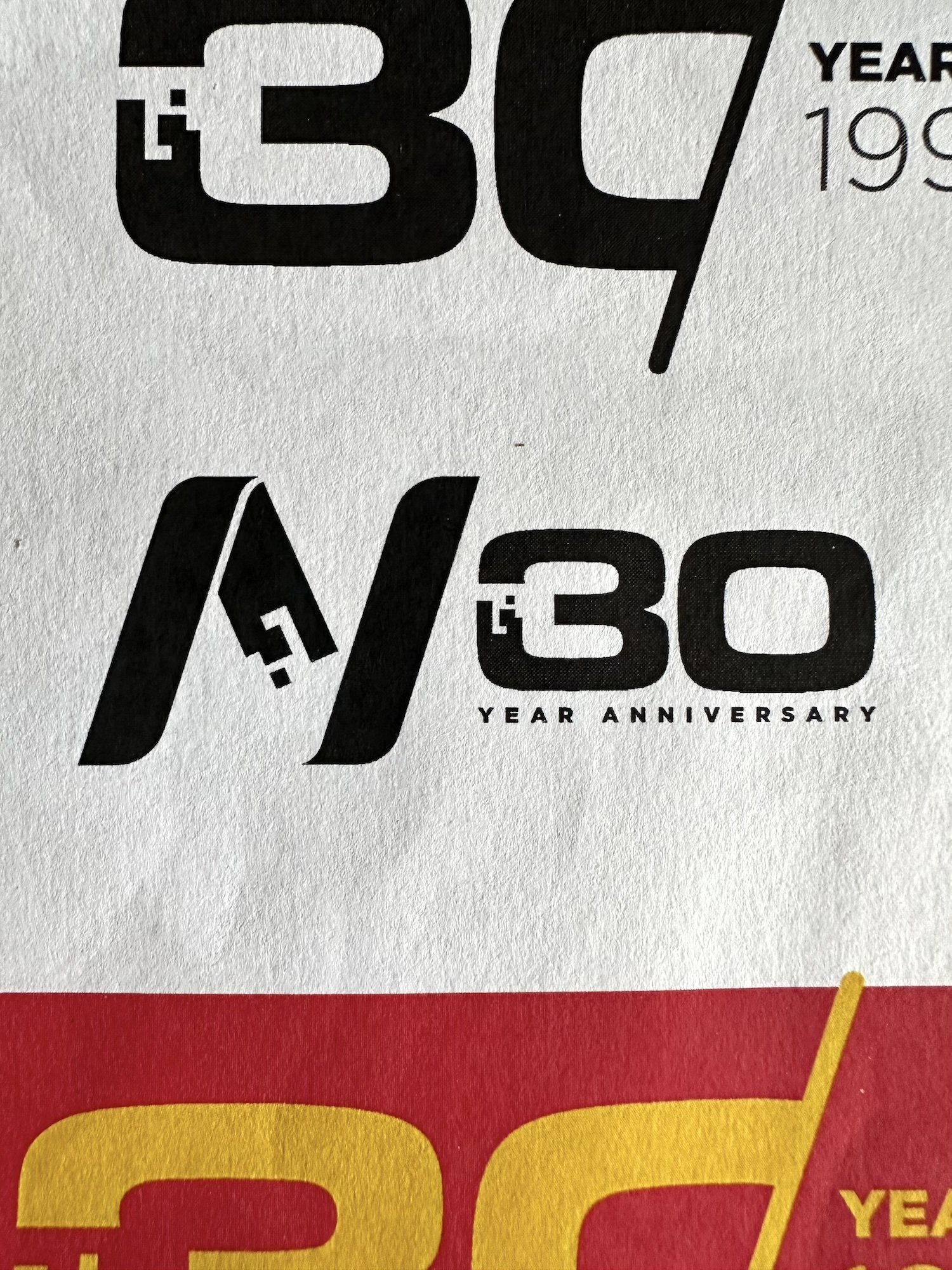
After a lot of trial and error, the font Eurostile Extended was chosen and as you can see from some of the sketch ideas above we tried to tweak the ‘30’ to include the digital element that features in our Nexus Alpha ‘N’. Unfortunately this had the effect of making the 30 look as if it were actually ‘BO’ which wasn’t ideal.


Like most creative work, suddenly everything can come together and you end up with something that you don’t think looks half bad - which then makes it easier to build on. The icons above were taking that initial idea then trying different variants that can be used in different contexts throughout the business. Starting in black and white is always a good idea as it keeps the distraction levels down but quite quickly we moved to colour variants on both light and dark backgrounds.

The last variants were applying the Nexus Alpha fading blues to the designs to see how they looked and after sign-off from the team and the boss we were good to go.
You’ll be seeing this special 30 year logo in all sorts of places this year as we celebrate the company, our clients and our employees - but now with added insight as to how it was created!